Data Viz
a01_data_viz.RmdThis vignette shows how to work with the sdcoe package
to make data viz. To begin, use the set_sdcoe_defaults()
function to set defaults.
set_sdcoe_defaults(
  style = "print",
  base_size = 8.5,
  base_family = "Roboto",
  base_line_size = 0.5,
  base_rect_size = 0.1,
  scale = "continuous"
)
This function will apply various defaults that will be used for all plots that follow. The examples below show how to make various example plots.
Single bar or Column Chart
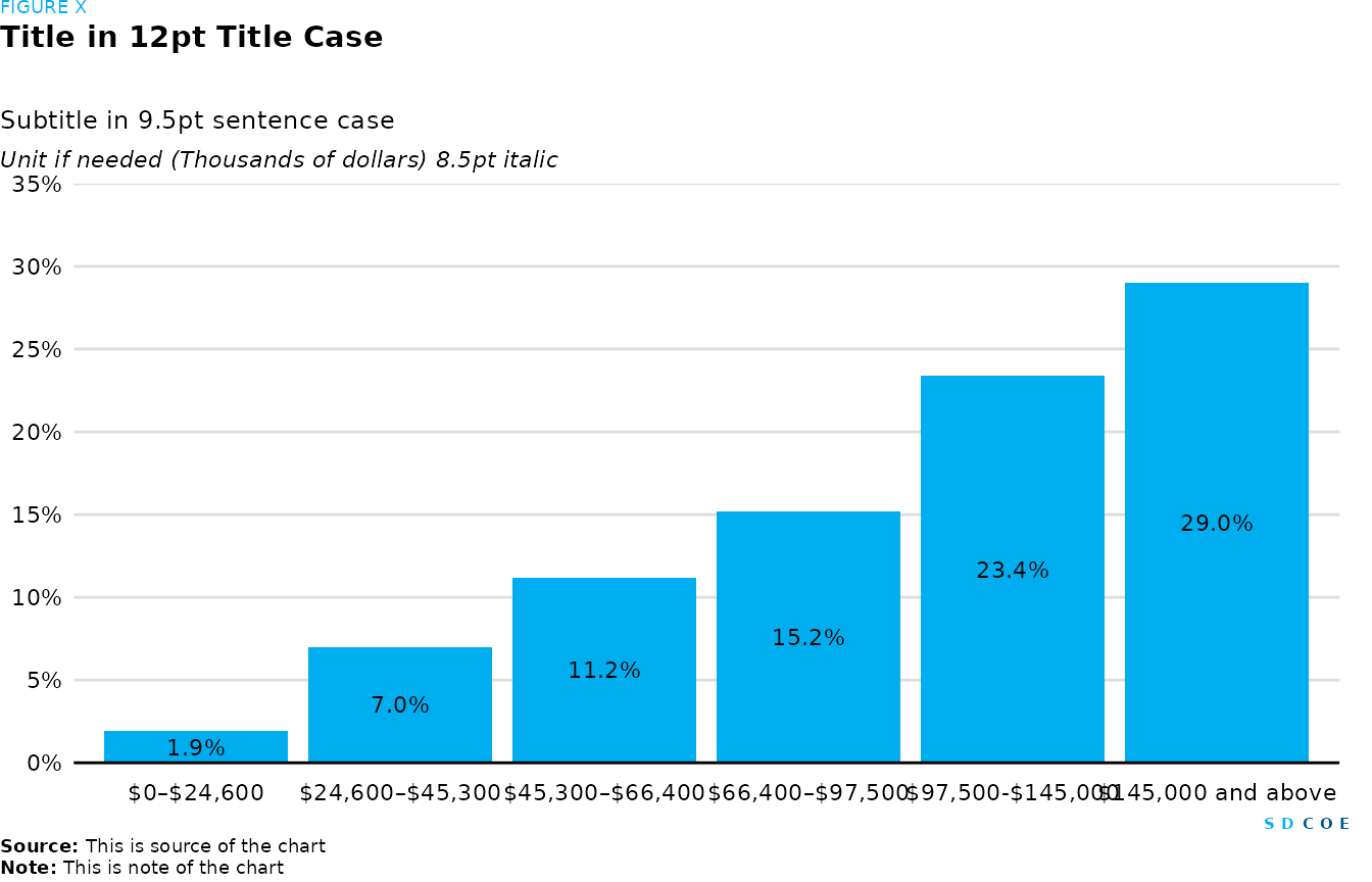
Column chart
# Create a dataframe 'df_bar_1' with income categories and corresponding college completion rates
df_bar_1 <- tibble(
  Income = c(
    "$0–$24,600",
    "$24,600–$45,300",
    "$45,300–$66,400",
    "$66,400–$97,500",
    "$97,500-$145,000",
    "$145,000 and above"
  ),
  College.Completion.Rate = c(1.9, 7, 11.2, 15.2, 23.4, 29)
)

# Create the plot
fig <- df_bar_1 |>
  # Convert 'Income' to factor and specify levels to maintain order
  mutate(Income = factor(Income, levels = Income)) |>
  # Set aesthetics
  ggplot(aes(
    x = Income,
    y = College.Completion.Rate,
    label = scales::percent(College.Completion.Rate / 100)
  )) +
  # Add column chart and set fill color
  geom_col(fill = palette_sdcoe_main[3]) +
  # Add text on chart
  geom_text(position = position_stack(vjust = 0.5)) +
  # Set y-axis limits and breaks
  scale_y_continuous(
    limits = c(0, 35),
    n.breaks = 7,
    # Delete the expansion space around the y-axis
    expand = c(0, 0),
    # Format y-axis labels as percentages
    labels = percent_format(scale = 1)
  ) +
  # Remove ticks from x and y axes
  remove_ticks() +
  # Remove both x and y axe's title
  labs(x = NULL, y = NULL)

# Create SDCOE plot with annotations and formatting
sdcoe_plot(
  sdcoe_figure("FIGURE X"),
  # Add title
  sdcoe_title("Title in 12pt Title Case"),
  # Add subtitle
  sdcoe_subtitle("Subtitle in 9.5pt sentence case"),
  # Add y-axis title
  sdcoe_y_title("Unit if needed (Thousands of dollars) 8.5pt italic"),
  # Add the previously created plot
  fig,
  # Add SDCOE logo
  sdcoe_logo_text(),
  # Add data source
  sdcoe_source("This is source of the chart"),
  # Add note
  sdcoe_note("This is note of the chart"),
  # Set layout parameters
  ncol = 1,
  heights = c(1, 5, 1, 1, 30, 1, 1, 1)
)
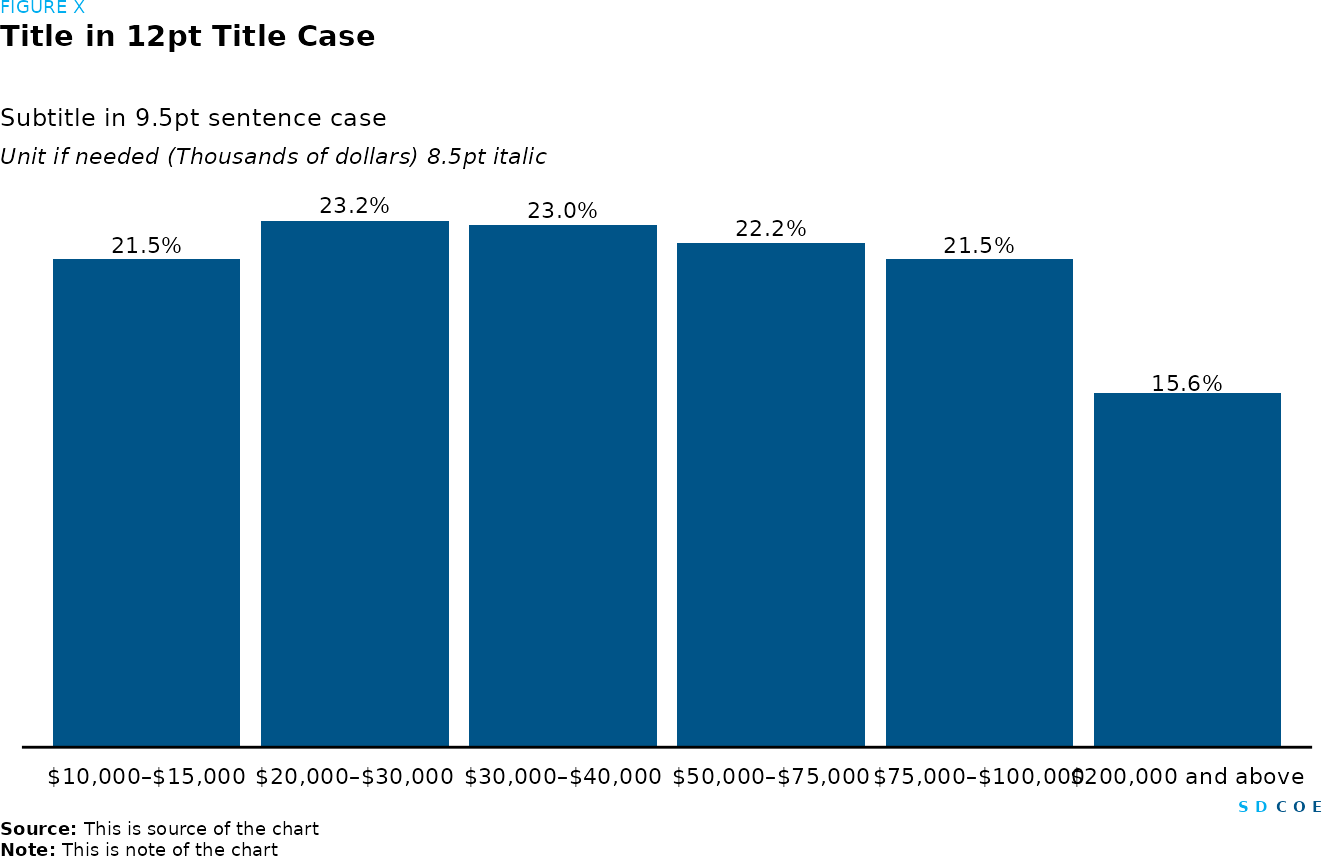
Column chart
# Create a dataframe 'df_bar_2' with income categories and corresponding college debt as a percentage of income
df_bar_2 <- tibble(
  Income = c(
    "$10,000–$15,000", "$20,000–$30,000",
    "$30,000–$40,000", "$50,000–$75,000", "$75,000–$100,000",
    "$200,000 and above"
  ),
  `College.Debt.(as.%.of.income)` = c(
    21.5, 23.2,
    23, 22.2, 21.5, 15.6
  )
)

# Plot
fig <- df_bar_2 |>
  mutate(
    # Convert 'Income' to factor and specify levels to maintain order
    Income = factor(Income, levels = Income),
    # Create labels for the text annotations
    Labels = comma(`College.Debt.(as.%.of.income)`, suffix = "%")
  ) |>
  # Set aesthetics
  ggplot(aes(x = Income, y = `College.Debt.(as.%.of.income)`)) +
  # Add column plot
  geom_col() +
  # Add text labels to the bars
  geom_text(aes(label = Labels),
    # Position labels within the stack
    position = position_stack(vjust = 1.03),
    size = 3,
    show.legend = FALSE
  ) +
  # Remove expansion space around y-axis and add limits
  scale_y_continuous(expand = c(0, 0), limits = c(0, 25)) +
  # Remove ticks from x and y axes
  remove_ticks() +
  # Remove both x and y axes
  remove_axis() +
  # Remove both x and y axe's title
  labs(x = NULL, y = NULL)

# Create SDCOE plot with annotations and formatting
sdcoe_plot(sdcoe_figure("FIGURE X"),
  # Add title
  sdcoe_title("Title in 12pt Title Case"),
  # Add subtitle
  sdcoe_subtitle("Subtitle in 9.5pt sentence case"),
  # Add y-axis title
  sdcoe_y_title("Unit if needed (Thousands of dollars) 8.5pt italic"),
  # Add the previously created plot
  fig,
  # Add SDCOE logo
  sdcoe_logo_text(),
  # Add data source
  sdcoe_source("This is source of the chart"),
  # Add note
  sdcoe_note("This is note of the chart"),
  # Set layout parameters
  ncol = 1, heights = c(1, 5, 1, 1, 30, 1, 1, 1)
)
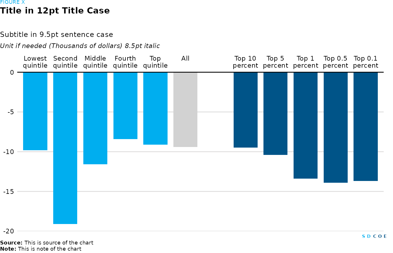
Column distribution chart
# Data
# Define categories and corresponding values
change <- tibble(
  Levels = c(
    "Lowest quintile", "Second quintile", "Middle quintile",
    "Fourth quintile", "Top quintile", "All", "",
    "Top 10 percent", "Top 5 percent", "Top 1 percent",
    "Top 0.5 percent", "Top 0.1 percent"
  ),
  Value = c(-9.8, -19.1, -11.6, -8.4, -9.1, -9.4, 0, -9.5, -10.4, -13.4, -13.9, -13.7)
)

# Data wrangling
change <- change |>
  mutate(
    # Assign Highlight based on category ('All' is highlighted)
    Highlight = c(rep("0", 5), "1", rep("2", 6)),
    # Convert 'Levels' to factor and specify levels to maintain order
    Levels = factor(Levels, levels = Levels)
  )

# Plot
fig <- change |>
  # Set aesthetics
  ggplot(aes(x = Levels, y = Value, fill = Highlight)) +
  # Add dodged column plot
  geom_col(show.legend = FALSE, position = "dodge", width = 0.8) +
  # Set y-axis limits, breaks and remove expansion space around y-axis
  scale_y_continuous(expand = c(0, 0), limits = c(-20, 0), n.breaks = 6) +
  # Move x-axis to the top, wrap text labels
  scale_x_discrete(position = "top", labels = function(x) str_wrap(x, width = 10)) +
  # Manually set fill colors for legend
  scale_fill_manual(
    # Specify legend colors
    values = c("0" = palette_sdcoe_main[[3]], "1" = palette_sdcoe_main[[2]], "2" = palette_sdcoe_main[[1]])
  ) +
  # Remove ticks from x and y axes
  remove_ticks() +
  # Remove axis labels
  labs(x = NULL, y = NULL) +
  theme(
    # Customize x-axis text
    axis.text.x = element_text()
  )

# Create SDCOE plot with annotations and formatting
sdcoe_plot(sdcoe_figure("FIGURE X"),
  # Add title
  sdcoe_title("Title in 12pt Title Case"),
  # Add subtitle
  sdcoe_subtitle("Subtitle in 9.5pt sentence case"),
  # Add y-axis title
  sdcoe_y_title("Unit if needed (Thousands of dollars) 8.5pt italic"),
  # Add the previously created plot
  fig,
  # Add SDCOE logo
  sdcoe_logo_text(),
  # Add data source
  sdcoe_source("This is source of the chart"),
  # Add note
  sdcoe_note("This is note of the chart"),
  # Set layout parameters
  ncol = 1, heights = c(1, 5, 1, 1, 30, 1, 1, 1)
)
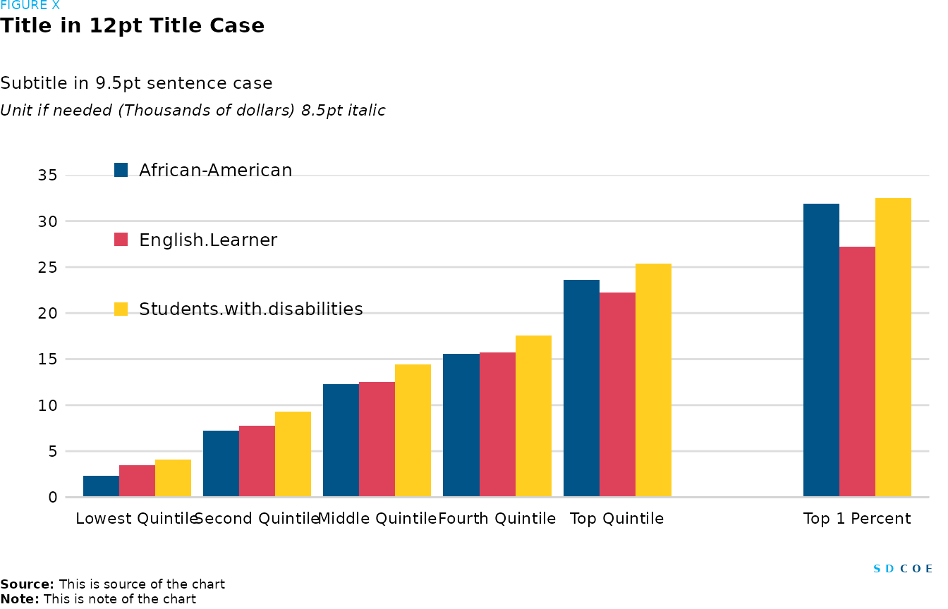
Grouped column chart
# Define categories and corresponding percentages
enrollement <- tibble(
  Quantiles = c(
    "Lowest Quintile", "Second Quintile", "Middle Quintile",
    "Fourth Quintile", "Top Quintile", "",
    "Top 1 Percent"
  ),
  `African-American` = c(2.3, 7.2, 12.3, 15.6, 23.6, 0, 31.9),
  `English.Learner` = c(3.5, 7.8, 12.5, 15.7, 22.2, 0, 27.2),
  `Students.with.disabilities` = c(4.1, 9.3, 14.4, 17.6, 25.4, 0, 32.5)
)

# Plot
fig <- enrollement |>
  # Convert 'Quantiles' to factor and specify levels to maintain order
  mutate(Quantiles = factor(Quantiles, levels = Quantiles)) |>
  # Reshape dataframe from wide to long format
  pivot_longer(
    cols = -"Quantiles",
    names_to = "Category",
    values_to = "Percentage"
  ) |>
  # Arrange rows by descending 'Percentage'
  arrange(desc(Percentage)) |>
  # Convert 'Category' to factor and specify levels to control legend order
  mutate(Category = factor(Category, levels = c("African-American", "English.Learner", "Students.with.disabilities"))) |>
  # Set aesthetics
  ggplot(aes(x = Quantiles, y = Percentage, fill = Category)) +
  # Add dodged column plot
  geom_col(position = "dodge") +
  # Set y-axis limits and breaks
  scale_y_continuous(limits = c(0, 35), n.breaks = 7, expand = c(0, 0)) +
  # Remove ticks from x and y axes
  remove_ticks() +
  # Manually set fill colors for legend
  scale_fill_manual(
    values = c(palette_sdcoe_main[[1]], palette_sdcoe_diverging[[5]], palette_sdcoe_main[[4]]),
    breaks = c("African-American", "English.Learner", "Students.with.disabilities"),
  ) +
  # Remove axis labels
  labs(x = NULL, y = NULL) +
  # Customize plot theme
  theme(
    # Set plot margins
    plot.margin = margin(t = 30, r = 10, l = 20, b = 20),
    # Set legend position
    legend.position = c(0.2, 0.8),
    # Set size of legend keys
    legend.key.size = unit(0.3, "cm"),
    # Customize x-axis line color
    axis.line.x.bottom = element_line(color = palette_sdcoe_main[[2]]),
    # Set legend direction
    legend.direction = "vertical",
    # Set spacing between legend keys
    legend.key.spacing.y = unit(1, "cm")
  )

# Create SDCOE plot with annotations and formatting
sdcoe_plot(sdcoe_figure("FIGURE X"),
  # Add title
  sdcoe_title("Title in 12pt Title Case"),
  # Add subtitle
  sdcoe_subtitle("Subtitle in 9.5pt sentence case"),
  # Add y-axis title
  sdcoe_y_title("Unit if needed (Thousands of dollars) 8.5pt italic"),
  # Add the previously created plot
  fig,
  # Add SDCOE logo
  sdcoe_logo_text(),
  # Add data source
  sdcoe_source("This is source of the chart"),
  # Add note
  sdcoe_note("This is note of the chart"),
  # Set layout parameters
  ncol = 1, heights = c(1, 5, 1, 1, 30, 1, 1, 1)
)
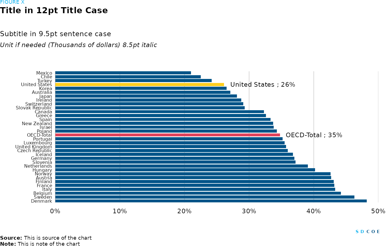
Horizontal bar chart
# Create a dataframe of countries and their corresponding PISA math scores
pisa_maths <- tibble(
  Country = c(
    "Denmark",
    "Sweden", "Belgium", "Italy", "France",
    "Finland", "Austria", "Norway", "Hungary",
    "Netherlands", "Slovenia", "Germany", "Iceland",
    "Czech Republic", "United Kingdom", "Luxembourg",
    "Portugal", "OECD-Total", "Poland", "Israel",
    "New Zealand", "Spain", "Greece", "Canada",
    "Slovak Republic", "Switzerland", "Ireland",
    "Japan", "Australia", "Korea", "United States",
    "Turkey", "Chile", "Mexico"
  ),
  `PISA.Math.%` = c(
    48.2,
    46.3, 44.2, 43.3, 43.2, 43.1, 42.7, 42.6, 40.2,
    39.1, 37.2, 37, 36.8, 36, 35.7, 35.5, 35.2,
    34.8, 34.3, 33.8, 33.7, 33.3, 32.6, 32.3, 29.3,
    29.1, 28.8, 28.1, 27.1, 26.5, 26.1, 24.2, 22.5,
    21
  )
)

# Data wrangling
pisa_maths <- pisa_maths |>
  # Arrange rows by descending 'PISA.Math.%'
  arrange(desc(`PISA.Math.%`)) |>
  mutate(
    # Convert 'Country' to factor and specify levels to maintain order
    Country = factor(Country, levels = Country),
    # Create 'Highlight' column based on specific conditions
    Highlight = case_match(
      Country,
      "United States" ~ "1",
      "OECD-Total" ~ "2",
      # No highlight for other countries
      .default = "0"
    ),
    # Create labels for highlighted countries
    Labels = ifelse(Highlight != "0", paste0(Country, " ; ", round(`PISA.Math.%`), "%"), "")
  )

# Plot
fig <- pisa_maths |>
  # Set aesthetics
  ggplot(aes(x = `PISA.Math.%`, y = Country, fill = Highlight)) +
  # Add stacked column plot
  geom_col(show.legend = F, position = position_stack(), width = 0.8) +
  # Format x-axis labels as percentages
  scale_x_continuous(expand = c(0, 0), limits = c(0, 50), labels = percent_format(scale = 1)) +
  # Adjust y-axis limits
  scale_y_discrete(expand = c(0, 0.03)) +
  # Remove ticks and labels from x and y axes
  remove_ticks() +
  labs(x = NULL, y = NULL) +
  # Add text labels to the bars
  geom_text(aes(label = Labels),
    # Position labels within the stack
    position = position_stack(),
    # Adjust horizontal alignment of labels
    hjust = -0.1,
    # Set text size
    size = 3,
    # Hide legend for the text labels
    show.legend = FALSE
  ) +
  # Add gridlines for x-axis
  scatter_grid() +
   # Manually set fill colors for legend
  scale_fill_manual(
    values = c("0" = palette_sdcoe_main[[1]], "1" = palette_sdcoe_main[[4]], "2" = palette_sdcoe_diverging[[5]])
  ) +
  theme(
    # Set plot margins
    plot.margin = margin(t = 30, r = 10, l = 20, b = 20),
    # Remove x-axis line
    axis.line.x = element_blank(),
    # Customize y-axis line color
    axis.line.y = element_line(color = palette_sdcoe_lt_gray[[6]], linewidth = 0.2),
    # Adjust y-axis text size
    axis.text.y = element_text(size = 6),
    # Remove major gridlines for y-axis
    panel.grid.major.y = element_blank()
  )


# Create SDCOE plot with annotations and formatting
sdcoe_plot(sdcoe_figure("FIGURE X"),
  # Add title
  sdcoe_title("Title in 12pt Title Case"),
  # Add subtitle
  sdcoe_subtitle("Subtitle in 9.5pt sentence case"),
  # Add y-axis title
  sdcoe_y_title("Unit if needed (Thousands of dollars) 8.5pt italic"),
  # Add the previously created plot
  fig,
  # Add SDCOE logo
  sdcoe_logo_text(),
  # Add data source
  sdcoe_source("This is source of the chart"),
  # Add note
  sdcoe_note("This is note of the chart"),
  # Set layout parameters
  ncol = 1, heights = c(1, 5, 1, 1, 30, 1, 1, 1)
)
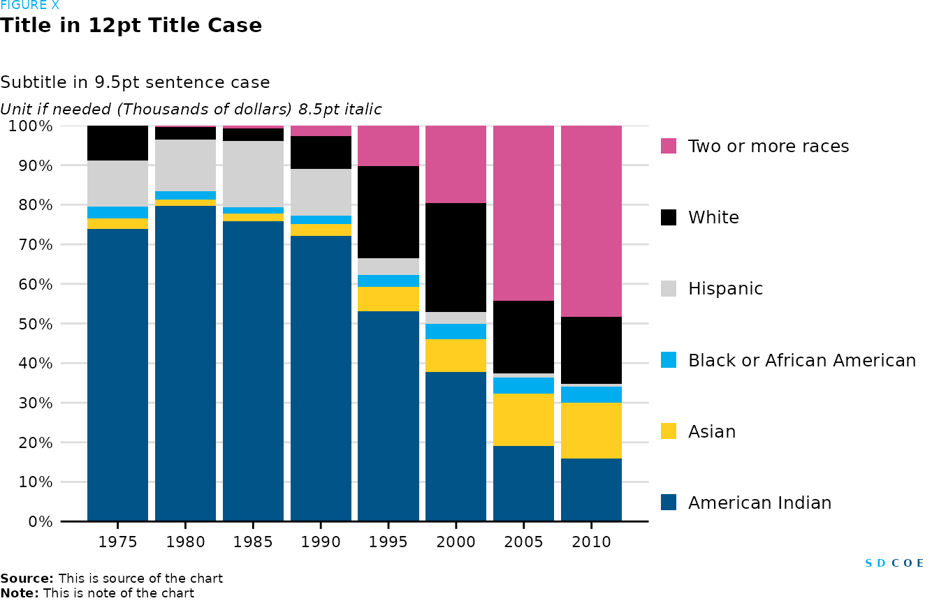
Stacked column chart and stacked column alternative
# Data for stacked column chart
demographics_1 <- tibble(
  Year = c(1975L, 1980L, 1985L, 1990L, 1995L, 2000L, 2005L, 2010L),
  `American Indian` = c(532981157, 993592692, 1701107541, 2406261909, 259165177, 247106515, 140697169, 87915690),
  Asian = c(18408678, 19938663, 43229817, 98839078, 29636829, 54384155, 97705509, 77519245),
  `Black or African American` = c(21700352, 25325109, 36121650, 72587881, 14828368, 25394180, 29763550, 22026735),
  Hispanic = c(84654869, 162558075, 372383223, 392854628, 20672404, 20495522, 7081396, 3650251),
  White = c(62433325, 40330965, 73922053, 280095044, 112903459, 179572522, 136383742, 93504435),
  `Two or more races` = c(770549, 3639482, 14563900, 86396313, 50219578, 128743191, 325815123, 265285834)
)

# Data wrangling
demographics_1 <- demographics_1 |>
  pivot_longer(
    # Pivot all columns except 'Year'
    cols = -Year,
    # Rename pivoted columns to 'Community'
    names_to = "Community",
    # Rename pivoted values to 'Population'
    values_to = "Population"
  ) |>
  # Group data by 'Year'
  group_by(Year) |>
  # Calculate percentage of population for each community in each year
  mutate(Population_pct = 100 * Population / sum(Population)) |>
  # Ungroup data
  ungroup() |>
  # Arrange data by ascending 'Population_pct'
  arrange(Population_pct) |>
  # Convert 'Community' to factor and specify levels to control stacking order
  mutate(Community = factor(Community,
    levels = c("Two or more races", "White", "Hispanic", "Black or African American", "Asian", "American Indian")
  ))

# Plot stacked column
fig <- demographics_1 |>
  # Set aesthetics
  ggplot(aes(x = Year, y = Population_pct, fill = Community)) +
  # Add stacked column plot
  geom_col(position = "stack") +
  # Format y-axis labels as percentages
  scale_y_continuous(expand = c(0, 0), labels = percent_format(scale = 1), n.breaks = 10) +
  # Set x-axis breaks
  scale_x_continuous(n.breaks = 10) +
  # Remove axis labels
  labs(x = NULL, y = NULL) +
  # Manually set fill colors for legend
  scale_fill_manual(
    # Reverse palette to match ascending order of 'Population_pct'
    values = rev(palette_sdcoe_categorical)
  ) +
  # Customize plot theme
  theme(
    # Set legend position
    legend.position = "right",
    # Set legend direction
    legend.direction = "vertical",
    # Adjust legend justification
    legend.justification = "top",
    # Set spacing between legend keys
    legend.key.spacing.y = unit(1, "cm")
  )

# Create SDCOE plot with annotations and formatting
sdcoe_plot(sdcoe_figure("FIGURE X"),
  # Add title
  sdcoe_title("Title in 12pt Title Case"),
  # Add subtitle
  sdcoe_subtitle("Subtitle in 9.5pt sentence case"),
  # Add y-axis title
  sdcoe_y_title("Unit if needed (Thousands of dollars) 8.5pt italic"),
  # Add the previously created plot
  fig,
  # Add SDCOE logo
  sdcoe_logo_text(),
  # Add data source
  sdcoe_source("This is source of the chart"),
  # Add note
  sdcoe_note("This is note of the chart"),
  # Set layout parameters
  ncol = 1, heights = c(1, 5, 1, 1, 30, 1, 1, 1)
)
# Data for stacked column chart
demographics_2 <- tibble(
  Year = c(1975L, 1980L, 1985L, 1990L, 1995L, 2000L, 2005L, 2010L),
  `American Indian` = c(532981157, 993592692, 1701107541, 2406261909, 259165177, 247106515, 140697169, 87915690),
  Asian = c(18408678, 19938663, 43229817, 98839078, 29636829, 54384155, 97705509, 77519245),
  `Black or African American` = c(21700352, 25325109, 36121650, 72587881, 14828368, 25394180, 29763550, 22026735),
  Hispanic = c(84654869, 162558075, 372383223, 392854628, 20672404, 20495522, 7081396, 3650251),
  White = c(62433325, 40330965, 73922053, 280095044, 112903459, 179572522, 136383742, 93504435),
  `Two or more races` = c(770549, 3639482, 14563900, 86396313, 50219578, 128743191, 325815123, 265285834)
)

# Data wrangling
demographics_2 <- demographics_2 |>
  # Pivot all columns except 'Year'
  pivot_longer(
    cols = -Year,
    names_to = "Community",
    values_to = "Population"
  ) |>
  # Group data by 'Year'
  group_by(Year) |>
  # Calculate percentage of population for each community in each year
  mutate(Population_pct = 100 * Population / sum(Population)) |>
  # Ungroup data
  ungroup() |>
  # Arrange data by ascending 'Population_pct'
  arrange(Population_pct) |>
  # Convert 'Community' to factor and specify levels to control stacking order
  mutate(Community = factor(Community,
    levels = c("American Indian", "Asian", "Black or African American", "Hispanic", "White", "Two or more races")
  ))

# Plot dodge column
fig <- demographics_2 |>
  # Set aesthetics
  ggplot(aes(x = Year, y = Population_pct, fill = Community)) +
  # Add dodged column plot
  geom_col(width = 4, position = position_dodge()) +
  # Format y-axis labels as percentages
  scale_y_continuous(expand = c(0, 0), limits = c(0, 90), labels = percent_format(scale = 1), n.breaks = 10) +
  # Set x-axis breaks
  scale_x_continuous(expand = c(0.01, 0), n.breaks = 10) +
  # Remove axis labels
  labs(x = NULL, y = NULL) +
  # Manually set fill colors for legend
  scale_fill_manual(
    # Use predefined palette
    values = (palette_sdcoe_categorical)
  ) +
  # Remove ticks from axes
  remove_ticks() +
  # Customize plot theme
  theme(
    # Set plot margins
    plot.margin = margin(t = 30, r = 10, l = 20, b = 20),
    # Adjust legend text size
    legend.text = element_text(size = 7),
    # Set size of legend keys
    legend.key.size = unit(0.2, "cm"),
    # Set spacing between legend keys
    legend.key.spacing.x = unit(0.5, "cm"),
    # Customize x-axis line color
    axis.line.x.bottom = element_line(color = palette_sdcoe_main[[2]])
  ) +
  # Specify legend layout
  guides(fill = guide_legend(nrow = 1))

# Create SDCOE plot with annotations and formatting
sdcoe_plot(sdcoe_figure("FIGURE X"),
  # Add title
  sdcoe_title("Title in 12pt Title Case"),
  # Add subtitle
  sdcoe_subtitle("Subtitle in 9.5pt sentence case"),
  # Add y-axis title
  sdcoe_y_title("Unit if needed (Thousands of dollars) 8.5pt italic"),
  # Add the previously created plot
  fig,
  # Add SDCOE logo
  sdcoe_logo_text(),
  # Add data source
  sdcoe_source("This is source of the chart"),
  # Add note
  sdcoe_note("This is note of the chart"),
  # Set layout parameters
  ncol = 1, heights = c(1, 5, 1, 1, 30, 1, 1, 1)
)
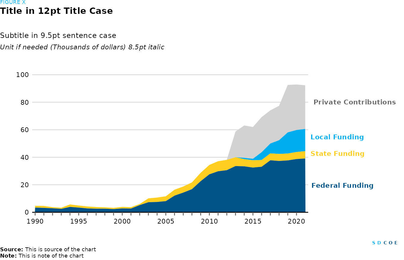
Stacked area chart
# Create a dataframe 'revenue' with funding data for different years
revenue <- tibble(
  check.names = FALSE,
  Year = c(
    1990L, 1991L, 1992L,
    1993L, 1994L, 1995L, 1996L, 1997L, 1998L, 1999L,
    2000L, 2001L, 2002L, 2003L, 2004L, 2005L, 2006L, 2007L,
    2008L, 2009L, 2010L, 2011L, 2012L, 2013L, 2014L,
    2015L, 2016L, 2017L, 2018L, 2019L, 2020L, 2021L
  ),
  "Federal Funding" = c(
    3.4, 3.2, 2.9, 2.5,
    3.9, 3.4, 2.8, 2.6, 2.6, 2.3, 2.8, 2.7, 5.2, 7.3, 7.5,
    8.1, 12.1, 14.3, 16.8, 22.6, 27.6, 29.8, 30.6,
    33.6, 33.4, 32.5, 33.1, 37.8, 37.3, 37.7, 38.7, 39.1
  ),
  "State Funding" = c(
    1.3, 1.4, 0.8, 0.8,
    1.8, 1.5, 1.4, 1.2, 1, 0.9, 1.1, 1, 0.8, 2.8, 3.2,
    3.5, 4.3, 4.4, 4.9, 6.1, 6.8, 7.3, 7.5, 6.4, 5.2, 5.3,
    4.9, 5, 5.1, 5, 5.1, 5.3
  ),
  "Local Funding" = c(
    0, 0, 0, 0, 0, 0, 0,
    0, 0, 0, 0, 0, 0, 0, 0, 0, 0, 0, 0, 0, 0, 0, 0, 0, 1,
    1.1, 5.7, 7.2, 10, 15.4, 16, 16.2
  ),
  "Private Contributions" = c(
    0, 0, 0, 0, 0, 0, 0,
    0, 0, 0, 0, 0, 0, 0, 0, 0, 0, 0, 0, 0, 0, 0, 0, 18.7,
    23.5, 23.1, 25.5, 24.1, 25, 34.5, 33.1, 31.7
  )
)

# Reshape the dataframe to long format for plotting convenience
revenue_long <- revenue |>
  pivot_longer(
    cols = -Year,
    names_to = "Source",
    values_to = "Revenue"
  ) |>
  # Convert 'Source' column to factor to control order of plotting
  mutate(Source = factor(Source, levels = c("Private Contributions", "Local Funding", "State Funding", "Federal Funding")))

# Create the plot
fig <- ggplot(data = revenue_long, aes(x = Year, y = Revenue, fill = Source)) +
  # Create stacked area plot
  geom_area(position = "stack", show.legend = FALSE) +
  # Set axis and legend labels
  labs(
    x = "Year",
    y = "Revenue",
    fill = "Source"
  ) +
  # Adjust x-axis limits and labels
  scale_x_continuous(
    expand = c(0.01, 0), breaks = 1990:2020,
    # Set x-axis labels every 5 years
    labels = ifelse(1990:2020 %in% seq(1990, 2020, 5), 1990:2020, "")
  ) +
  # Adjust y-axis limits and breaks
  scale_y_continuous(expand = c(0, 0), limits = c(0, 100), n.breaks = 7) +
  # Allow text to extend beyond plot area
  coord_cartesian(clip = "off") +
  # Add labels at the end of each stack
  geom_text(
    data = revenue_long |>
      group_by(Source) |>
      summarise(Year = max(Year), Revenue = max(Revenue)),
    aes(x = Year, y = Revenue, label = Source, color = Source),
    position = position_stack(vjust = 0.5),
    size = 3, fontface = "bold",
    hjust = -0.1,
    show.legend = FALSE
  ) +
  # Set manual color scale
  scale_color_manual(values = c(
    "Federal Funding" = palette_sdcoe_main[[1]],
    "Private Contributions" = palette_sdcoe_lt_gray[[7]],
    "Local Funding" = palette_sdcoe_main[[3]],
    "State Funding" = palette_sdcoe_main[[4]]
  )) +
  # Set manual fill scale
  scale_fill_manual(values = c(
    "Federal Funding" = palette_sdcoe_main[[1]],
    "Private Contributions" = palette_sdcoe_main[[2]],
    "Local Funding" = palette_sdcoe_main[[3]],
    "State Funding" = palette_sdcoe_main[[4]]
  )) +
  theme(
    # Remove axis titles
    axis.title = element_blank(),
    # Adjust x-axis ticks
    axis.ticks.x = element_line(color = palette_sdcoe_lt_gray[[7]]),
    # Set plot margins
    plot.margin = margin(t = 30, r = 120, l = 20, b = 20),
    # Remove major gridlines for x-axis
    panel.grid.major.x = element_blank()
  )

# Create SDCOE plot with annotations and formatting
sdcoe_plot(sdcoe_figure("FIGURE X"),
  # Add title
  sdcoe_title("Title in 12pt Title Case"),
  # Add subtitle
  sdcoe_subtitle("Subtitle in 9.5pt sentence case"),
  # Add y-axis title
  sdcoe_y_title("Unit if needed (Thousands of dollars) 8.5pt italic"),
  # Add the previously created plot
  fig,
  # Add SDCOE logo
  sdcoe_logo_text(),
  # Add data source
  sdcoe_source("This is source of the chart"),
  # Add note
  sdcoe_note("This is note of the chart"),
  # Set layout parameters
  ncol = 1, heights = c(1, 5, 1, 1, 30, 1, 1, 1)
)
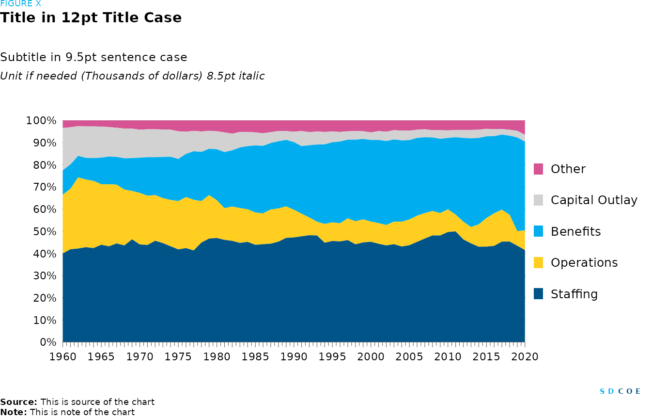
100% Area chart
# Data frame containing spending data over fiscal years
spending <- tibble(
  Fiscal.Year = c(
    1960L,
    1961L, 1962L, 1963L, 1964L, 1965L, 1966L, 1967L,
    1968L, 1969L, 1970L, 1971L, 1972L, 1973L, 1974L,
    1975L, 1976L, 1977L, 1978L, 1979L, 1980L, 1981L,
    1982L, 1983L, 1984L, 1985L, 1986L, 1987L,
    1988L, 1989L, 1990L, 1991L, 1992L, 1993L, 1994L,
    1995L, 1996L, 1997L, 1998L, 1999L, 2000L, 2001L,
    2002L, 2003L, 2004L, 2005L, 2006L, 2007L,
    2008L, 2009L, 2010L, 2011L, 2012L, 2013L, 2014L,
    2015L, 2016L, 2017L, 2018L, 2019L, 2020L
  ),
  Staffing = c(
    0.399,
    0.419, 0.422, 0.428, 0.424, 0.439, 0.432, 0.445,
    0.436, 0.463, 0.44, 0.438, 0.457, 0.447, 0.432,
    0.418, 0.424, 0.413, 0.449, 0.467, 0.469, 0.461,
    0.457, 0.447, 0.452, 0.439, 0.442, 0.443,
    0.453, 0.47, 0.472, 0.477, 0.482, 0.481, 0.448,
    0.456, 0.454, 0.46, 0.441, 0.45, 0.452, 0.443,
    0.436, 0.442, 0.431, 0.437, 0.452, 0.467, 0.481,
    0.481, 0.496, 0.499, 0.463, 0.445, 0.43, 0.431,
    0.434, 0.453, 0.454, 0.435, 0.415
  ),
  Operations = c(
    0.265,
    0.273, 0.321, 0.305, 0.303, 0.273, 0.28, 0.265,
    0.252, 0.218, 0.232, 0.222, 0.206, 0.203, 0.209,
    0.218, 0.23, 0.228, 0.187, 0.196, 0.17, 0.143,
    0.155, 0.157, 0.147, 0.146, 0.139, 0.154, 0.15,
    0.142, 0.125, 0.102, 0.08, 0.062, 0.085, 0.084,
    0.082, 0.098, 0.104, 0.104, 0.091, 0.093,
    0.092, 0.102, 0.112, 0.116, 0.118, 0.115, 0.11,
    0.101, 0.102, 0.076, 0.08, 0.074, 0.101, 0.129,
    0.147, 0.144, 0.121, 0.066, 0.089
  ),
  Benefits = c(
    0.11, 0.11,
    0.097, 0.098, 0.103, 0.12, 0.125, 0.125, 0.141,
    0.148, 0.159, 0.174, 0.171, 0.186, 0.195,
    0.19, 0.195, 0.219, 0.222, 0.209, 0.23, 0.253,
    0.254, 0.273, 0.285, 0.303, 0.305, 0.299, 0.303,
    0.3, 0.305, 0.305, 0.326, 0.348, 0.359, 0.361,
    0.369, 0.355, 0.368, 0.363, 0.368, 0.375, 0.379,
    0.371, 0.367, 0.358, 0.351, 0.342, 0.332,
    0.335, 0.322, 0.349, 0.378, 0.4, 0.39, 0.369, 0.348,
    0.339, 0.357, 0.423, 0.4
  ),
  "Capital Outlay" = c(
    0.191,
    0.168, 0.134, 0.142, 0.143, 0.14, 0.133, 0.132,
    0.134, 0.133, 0.126, 0.126, 0.126, 0.124, 0.122,
    0.125, 0.1, 0.092, 0.092, 0.081, 0.081, 0.089,
    0.075, 0.07, 0.064, 0.059, 0.057, 0.049, 0.046,
    0.04, 0.047, 0.068, 0.059, 0.059, 0.056, 0.049,
    0.043, 0.038, 0.039, 0.035, 0.034, 0.04, 0.042,
    0.042, 0.044, 0.043, 0.037, 0.036, 0.033,
    0.039, 0.034, 0.033, 0.036, 0.038, 0.037, 0.034,
    0.031, 0.025, 0.027, 0.03, 0.031
  ),
  Other = c(
    0.034,
    0.031, 0.026, 0.027, 0.027, 0.028, 0.03, 0.033,
    0.037, 0.037, 0.042, 0.04, 0.04, 0.041, 0.042,
    0.049, 0.051, 0.047, 0.05, 0.047, 0.049, 0.054,
    0.06, 0.052, 0.052, 0.054, 0.058, 0.053, 0.048,
    0.048, 0.051, 0.048, 0.053, 0.05, 0.052, 0.05,
    0.052, 0.049, 0.048, 0.049, 0.054, 0.048, 0.051,
    0.044, 0.046, 0.046, 0.042, 0.04, 0.044, 0.044,
    0.045, 0.043, 0.043, 0.043, 0.042, 0.038,
    0.04, 0.039, 0.042, 0.047, 0.065
  )
)

# Create a plot from the spending data
fig <- spending |>
  # Convert data from wide to long format for plotting
  pivot_longer(
    # Exclude Fiscal.Year from pivot operation
    cols = -Fiscal.Year,
    # New column name for categories
    names_to = "Category",
    # New column name for percentage values
    values_to = "Percentage"
  ) |>
  # Modify the data for plotting
  mutate(
    # Convert percentage values to percentages
    Percentage = Percentage * 100,
    # Specify order of categories for better visualization
    Category = factor(Category, levels = c("Other", "Capital Outlay", "Benefits", "Operations", "Staffing"))
  ) |>
  # Create ggplot object with specified aesthetics
  ggplot(aes(x = Fiscal.Year, y = Percentage, fill = Category)) +
  # Add filled area plot
  geom_area(position = "fill") +
  # Customize y-axis
  scale_y_continuous(
    # Remove y-axis expansion
    expand = c(0, 0),
    # Format y-axis labels as percentages
    labels = percent_format(scale = 100),
    # Set number of breaks on y-axis
    n.breaks = 10
  ) +
  # Customize x-axis
  scale_x_continuous(
    expand = c(0, 0),
    # Set breaks for each year
    breaks = 1960:2020,
    # Show labels for every 5 years
    labels = ifelse(1960:2020 %in% seq(1960, 2020, 5), 1960:2020, "")
  ) +
  # Remove axis labels
  labs(x = NULL, y = NULL) +
  # Customize fill colors for each category
  scale_fill_manual(values = c(
    "Staffing" = palette_sdcoe_main[[1]],
    "Capital Outlay" = palette_sdcoe_main[[2]],
    "Benefits" = palette_sdcoe_main[[3]],
    "Operations" = palette_sdcoe_main[[4]],
    "Other" = palette_sdcoe_main[[5]]
  )) +
  # Customize plot guides
  guides(
    # Add minor ticks on x-axis
    x = guide_axis(cap = "both", minor.ticks = TRUE)
  ) +
  # Customize plot theme
  theme(
    # Set legend position
    legend.position = "right",
    # Set legend direction
    legend.direction = "vertical",
    # Set legend key width
    legend.key.width = unit(0.3, "cm"),
    # Set spacing between legend keys
    legend.key.spacing.y = unit(0.5, "cm"),
    # Customize axis ticks
    axis.ticks = element_line(color = palette_sdcoe_lt_gray[[7]], linewidth = 0.2),
    # Customize axis lines
    axis.line = element_line(linewidth = 0.2, color = palette_sdcoe_lt_gray[[7]]),
    # Customize major grid lines on y-axis
    panel.grid.major.y = element_line(color = palette_sdcoe_lt_gray[[7]], linewidth = 0.2),
    # Set plot margins
    plot.margin = margin(t = 30, r = 10, l = 20, b = 20)
  )

# Create SDCOE plot with annotations and formatting
sdcoe_plot(sdcoe_figure("FIGURE X"),
  # Add title
  sdcoe_title("Title in 12pt Title Case"),
  # Add subtitle
  sdcoe_subtitle("Subtitle in 9.5pt sentence case"),
  # Add y-axis title
  sdcoe_y_title("Unit if needed (Thousands of dollars) 8.5pt italic"),
  # Add the previously created plot
  fig,
  # Add SDCOE logo
  sdcoe_logo_text(),
  # Add data source
  sdcoe_source("This is source of the chart"),
  # Add note
  sdcoe_note("This is note of the chart"),
  # Set layout parameters
  ncol = 1, heights = c(1, 5, 1, 1, 30, 1, 1, 1)
)
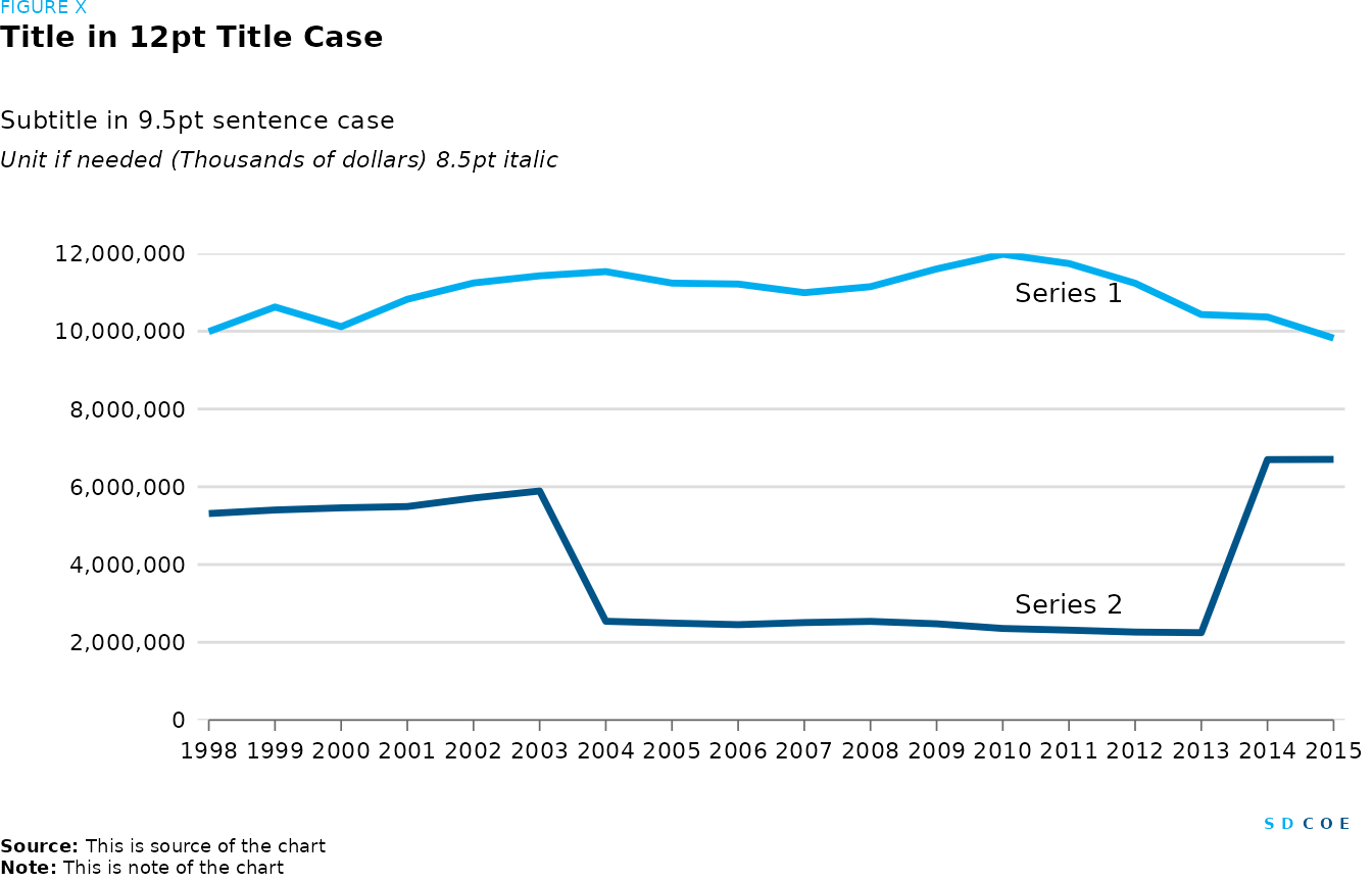
Line chart
students <- tibble(
  `1998` = c(9991081, 5311411),
  `1999` = c(10622794, 5402864),
  `2000` = c(10116952, 5457793),
  `2001` = c(10821819, 5491464),
  `2002` = c(11240815, 5710759),
  `2003` = c(11425090, 5890821),
  `2004` = c(11533235, 2540889),
  `2005` = c(11237238, 2494145),
  `2006` = c(11213184, 2453741),
  `2007` = c(10991496, 2507728),
  `2008` = c(11145436, 2537825),
  `2009` = c(11602000, 2475785),
  `2010` = c(11979290, 2355803),
  `2011` = c(11740265, 2312909),
  `2012` = c(11234147, 2262961),
  `2013` = c(10429316, 2247747),
  `2014` = c(10365372, 6698800),
  `2015` = c(9822475, 6704300)
)
# Data wrangling
students <- students |>
  # Transpose the data frame
  t() |>
  # Convert to data frame
  as.data.frame() |>
  # Convert row names to a column
  rownames_to_column() |>
  # Rename columns
  `names<-`(c("Year", "Series 1", "Series 2")) |>
  # Convert all columns to numeric
  mutate(across(everything(), as.numeric)) |>
  # Convert data from wide to long format for plotting
  pivot_longer(
    # Exclude Year from pivot operation
    cols = -Year,
    # New column name for series
    names_to = "Series",
    # New column name for counts
    values_to = "Count"
  )
# Plot
fig <- students |>
  # Set aesthetics for ggplot
  ggplot(aes(x = Year, y = Count, color = Series)) +
  # Add line plot
  geom_line(show.legend = FALSE, linewidth = 1.2) +
  # Add text annotation for Series 1
  annotate("text", x = 2011, y = 11e+06, label = "Series 1", size = 3.5) +
  # Add text annotation for Series 2
  annotate("text", x = 2011, y = 3e+06, label = "Series 2", size = 3.5) +
  # Customize x-axis
  scale_x_continuous(expand = c(0.01, 0), breaks = 1998:2015) +
  # Customize y-axis
  scale_y_continuous(expand = c(0, 0), limits = c(0, 12e+06), labels = comma, n.breaks = 7) +
  # Customize plot guides
  guides(
    # Add minor ticks on x-axis
    x = guide_axis(cap = "both")
  ) +
  # Customize color scale
  scale_color_manual(
    values = c(
      "Series 1" = palette_sdcoe_main[[3]],
      "Series 2" = palette_sdcoe_main[[1]]
    )
  ) +
  # Remove axis labels
  labs(x = NULL, y = NULL) +
  # Customize plot theme
  theme(
    # Set plot margins
    plot.margin = margin(t = 30, r = 10, l = 20, b = 20),
    # Customize axis ticks
    axis.ticks = element_line(color = palette_sdcoe_lt_gray[[7]], linewidth = 0.3),
    # Customize x-axis line
    axis.line.x = element_line(color = palette_sdcoe_lt_gray[[7]], linewidth = 0.3),
  )
# Create SDCOE plot with annotations and formatting
sdcoe_plot(sdcoe_figure("FIGURE X"),
  # Add title
  sdcoe_title("Title in 12pt Title Case"),
  # Add subtitle
  sdcoe_subtitle("Subtitle in 9.5pt sentence case"),
  # Add y-axis title
  sdcoe_y_title("Unit if needed (Thousands of dollars) 8.5pt italic"),
  # Add the previously created plot
  fig,
  # Add SDCOE logo
  sdcoe_logo_text(),
  # Add data source
  sdcoe_source("This is source of the chart"),
  # Add note
  sdcoe_note("This is note of the chart"),
  # Set layout parameters
  ncol = 1, heights = c(1, 5, 1, 1, 30, 1, 1, 1)
)
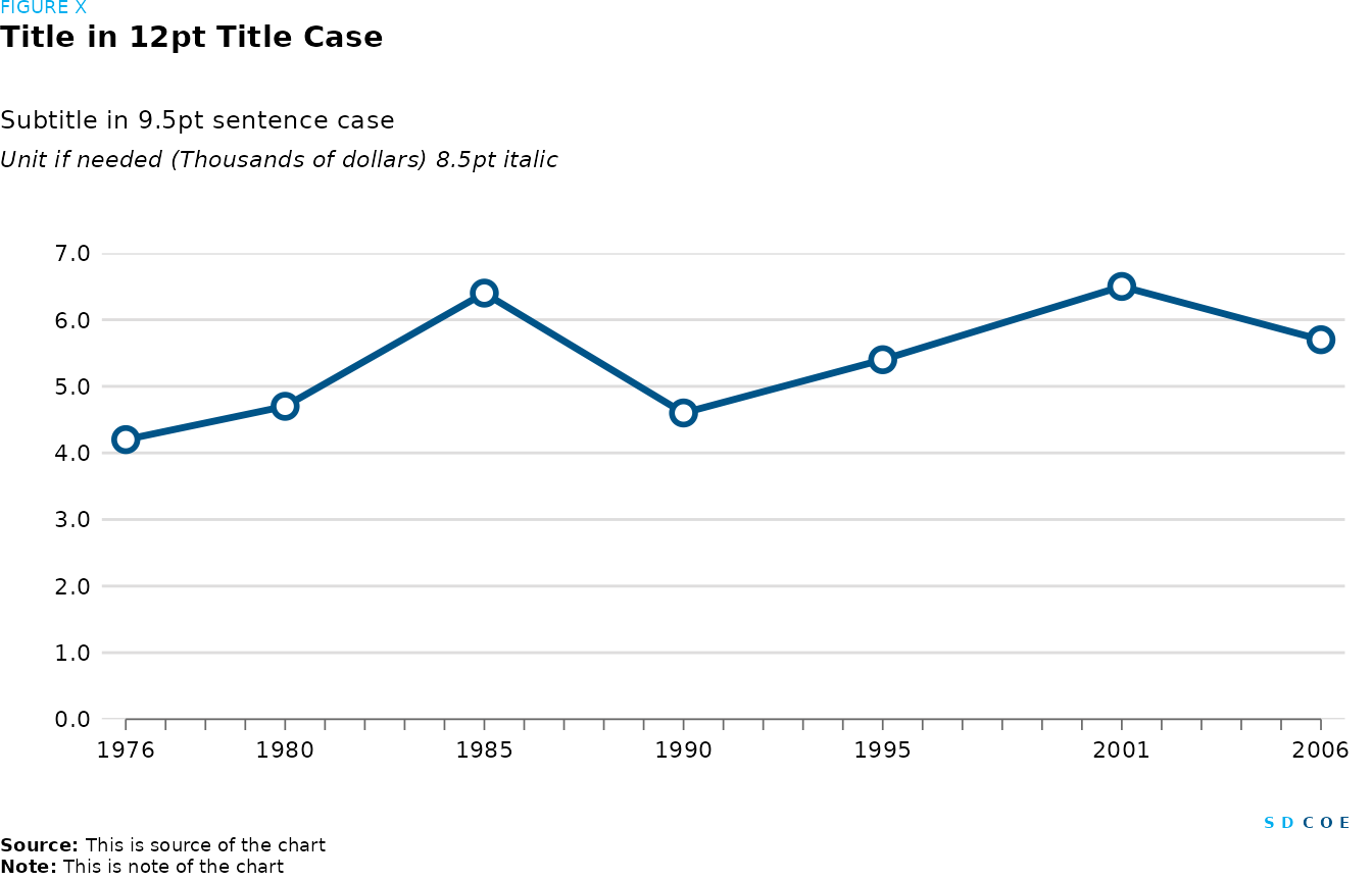
Bar chart single line irregular year intervals
# Create a dataframe 'dropout' with dropout rates for different years
dropout <- tibble(
        Year = c(1976L, 1980L, 1985L, 1990L, 1995L, 2001L, 2006L),
       Rates = c(4.2, 4.7, 6.4, 4.6, 5.4, 6.5, 5.7)
           )
# plots line with markers
fig = dropout |>
  # Set aesthetics for ggplot
  ggplot(aes(x = Year, y = Rates)) +
  # Add line plot
  geom_line(show.legend = FALSE, linewidth = 1.2) +
  # Add point markers
  geom_point(shape = 21,stroke = 1.5, size = 3, color = palette_sdcoe_main[[1]], fill = "white") +
  # Customize y-axis
  scale_y_continuous(expand = c(0, 0), limits = c(0.0, 7.0),
                     labels = label_number(accuracy = 0.1),
                     n.breaks = 7) +
  # Customize x-axis
  scale_x_continuous(
    # Set expansion limits for better visualization
    expand = c(0.02, 0),
    # Set breaks for each year
    breaks = 1976:2006,
     # Show labels for every 5 years
    labels = ifelse(1976:2006 %in% c(1976, seq(1960, 1995, 5), 2001, 2006), 1976:2006, "")
  )+
  # Customize plot guides
  guides(
    # Add minor ticks on x-axis
    x = guide_axis(cap = "both")
  )+
  # Remove axis labels
  labs(x = NULL, y = NULL) +
  # Customize plot theme
  theme(
    # Set plot margins
    plot.margin = margin(t = 30, r = 10, l = 20, b = 20),
    # Customize axis ticks
    axis.ticks = element_line(color = palette_sdcoe_lt_gray[[7]], linewidth = 0.3),
    # Customize x-axis line
    axis.line.x = element_line(color = palette_sdcoe_lt_gray[[7]], linewidth = 0.3)
  )

# Create SDCOE plot with annotations and formatting
sdcoe_plot(sdcoe_figure("FIGURE X"),
  # Add title
  sdcoe_title("Title in 12pt Title Case"),
  # Add subtitle
  sdcoe_subtitle("Subtitle in 9.5pt sentence case"),
  # Add y-axis title
  sdcoe_y_title("Unit if needed (Thousands of dollars) 8.5pt italic"),
  # Add the previously created plot
  fig,
  # Add SDCOE logo
  sdcoe_logo_text(),
  # Add data source
  sdcoe_source("This is source of the chart"),
  # Add note
  sdcoe_note("This is note of the chart"),
  # Set layout parameters
  ncol = 1, heights = c(1, 5, 1, 1, 30, 1, 1, 1)
)
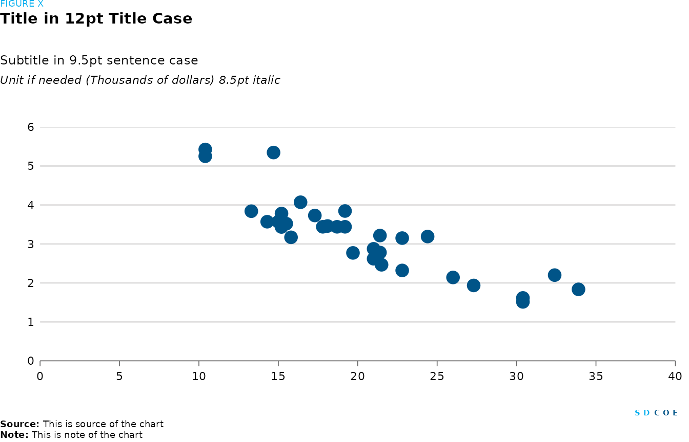
Point chart and dot charts
Scatter plot
# Data for scatter plot
df_scatter <- tibble(
  mpg = c(
    21, 21, 22.8,
    21.4, 18.7, 18.1, 14.3, 24.4, 22.8, 19.2, 17.8,
    16.4, 17.3, 15.2, 10.4, 10.4, 14.7, 32.4, 30.4,
    33.9, 21.5, 15.5, 15.2, 13.3, 19.2, 27.3, 26, 30.4,
    15.8, 19.7, 15, 21.4
  ),
  wt = c(
    2.62, 2.875,
    2.32, 3.215, 3.44, 3.46, 3.57, 3.19, 3.15, 3.44,
    3.44, 4.07, 3.73, 3.78, 5.25, 5.424, 5.345, 2.2,
    1.615, 1.835, 2.465, 3.52, 3.435, 3.84, 3.845,
    1.935, 2.14, 1.513, 3.17, 2.77, 3.57, 2.78
  )
)

# Plot
fig <- df_scatter |>
  # Set aesthetics for ggplot
  ggplot(aes(x = mpg, y = wt)) +
  # Add point markers
  geom_point(size = 4, color = palette_sdcoe_main[[1]], fill = "white") +
  # Customize x-axis, set expansion, limits and breaks
  scale_x_continuous(
    expand = c(0, 0), limits = c(0, 40),
    n.breaks = 10
  ) +
  # Customize y-axis, set expansion, limits and breaks
  scale_y_continuous(
    expand = c(0, 0), limits = c(0, 6),
    n.breaks = 6
  ) +
  # Customize plot guides
  guides(
    # Add minor ticks on x-axis
    x = guide_axis(cap = "both")
  ) +
  # Remove axis labels
  labs(x = NULL, y = NULL) +
  # Customize plot theme
  theme(
    # Set plot margins
    plot.margin = margin(t = 30, r = 10, l = 20, b = 20),
    # Customize axis ticks
    axis.ticks = element_line(color = palette_sdcoe_lt_gray[[7]], linewidth = 0.3),
    # Customize axis lines
    axis.line = element_line(color = palette_sdcoe_lt_gray[[7]], linewidth = 0.3)
  )
# Create SDCOE plot with annotations and formatting
sdcoe_plot(sdcoe_figure("FIGURE X"),
  # Add title
  sdcoe_title("Title in 12pt Title Case"),
  # Add subtitle
  sdcoe_subtitle("Subtitle in 9.5pt sentence case"),
  # Add y-axis title
  sdcoe_y_title("Unit if needed (Thousands of dollars) 8.5pt italic"),
  # Add the previously created plot
  fig,
  # Add SDCOE logo
  sdcoe_logo_text(),
  # Add data source
  sdcoe_source("This is source of the chart"),
  # Add note
  sdcoe_note("This is note of the chart"),
  # Set layout parameters
  ncol = 1, heights = c(1, 5, 1, 1, 30, 1, 1, 1)
)
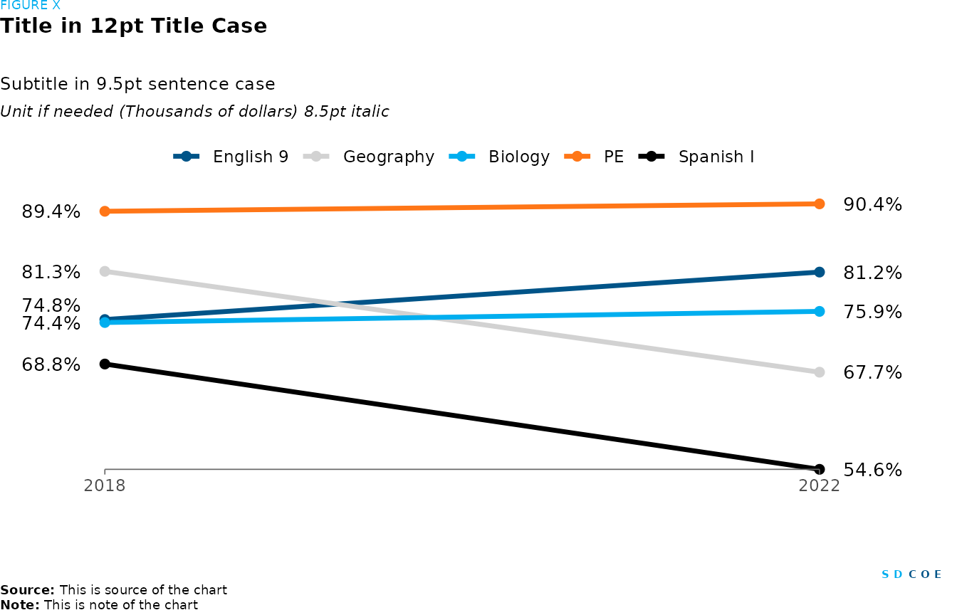
Slope chart
# Data for slope chart
df_slop <- tibble(
  Fields = c(
    "English 9", "Geography", "Biology", "PE", "Spanish I"
  ),
  `2018` = c(0.748, 0.813, 0.744, 0.894, 0.688),
  `2022` = c(0.812, 0.677, 0.759, 0.904, 0.546)
)

# Data wrangling
df_slop <- df_slop |>
  # Convert data from wide to long format for plotting
  pivot_longer(
    # Exclude Fields from pivot operation
    cols = -Fields,
    # New column name for years
    names_to = "Year",
    # New column name for values
    values_to = "Value"
  ) |>
  # Modify the data for plotting
  mutate(
    # Convert Year to numeric
    Year = as.numeric(Year),
    # Format Value as percentage
    Labels = percent(Value, accuracy = 0.1),
    # Specify order of fields for better visualization
    Fields = factor(Fields, levels = c("English 9", "Geography", "Biology", "PE", "Spanish I"))
  )

# Plot
fig <- df_slop |>
  # Set aesthetics for ggplot
  ggplot(aes(x = Year, y = Value, color = Fields)) +
  # Add line plot and set line width
  geom_line(linewidth = 1.2) +
  # Add point markers and set point size
  geom_point(size = 2) +
  # Add text annotations for each field at the extremities of the lines
  annotate("text",
    x = ifelse(df_slop$Year == 2018, df_slop$Year - 0.3, df_slop$Year + 0.3),
    y = c(df_slop$Value[1] + 0.02, df_slop$Value[-1]), label = df_slop$Labels, size = 3.5
  ) +
  # Allow text to extend beyond plot area
  coord_cartesian(clip = "off") +
  # Set plot theme
  theme_minimal() +
  # Customize x-axis and y-axis
  scale_x_continuous(expand = c(0.01, 0), breaks = c(2018, 2022), labels = c("2018", "2022")) +
  scale_y_continuous(expand = c(0, 0)) +
  # Customize plot guides
  guides(
    # Add minor ticks on x-axis
    x = guide_axis(cap = "both")
  ) +
  # Customize color scale
  scale_color_manual(values = c(
    "English 9" = palette_sdcoe_main[[1]],
    "Geography" = palette_sdcoe_main[[2]],
    "Biology" = palette_sdcoe_main[[3]],
    "PE" = palette_sdcoe_main[[7]],
    "Spanish I" = palette_sdcoe_main[[8]]
  )) +
  # Customize plot theme
  theme(
    # Set plot margins
    plot.margin = margin(t = 5, r = 40, l = 20, b = 40),
    # Customize axis ticks
    axis.ticks.x = element_line(color = palette_sdcoe_lt_gray[[7]], linewidth = 0.3),
    # Remove y-axis ticks
    axis.ticks.y = element_blank(),
    # Customize x-axis line
    axis.line.x = element_line(color = palette_sdcoe_lt_gray[[7]], linewidth = 0.3),
    # Remove y-axis line
    axis.line.y = element_blank(),
    # Remove axis titles
    axis.title = element_blank(),
    # Remove y-axis text
    axis.text.y = element_blank(),
    # Remove gridlines
    panel.grid = element_blank(),
    # Set legend position
    legend.position = "top",
    # Remove legend title
    legend.title = element_blank()
  )

# Create SDCOE plot with annotations and formatting
sdcoe_plot(sdcoe_figure("FIGURE X"),
  # Add title
  sdcoe_title("Title in 12pt Title Case"),
  # Add subtitle
  sdcoe_subtitle("Subtitle in 9.5pt sentence case"),
  # Add y-axis title
  sdcoe_y_title("Unit if needed (Thousands of dollars) 8.5pt italic"),
  # Add the previously created plot
  fig,
  # Add SDCOE logo
  sdcoe_logo_text(),
  # Add data source
  sdcoe_source("This is source of the chart"),
  # Add note
  sdcoe_note("This is note of the chart"),
  # Set layout parameters
  ncol = 1, heights = c(1, 5, 1, 1, 30, 1, 1, 1)
)
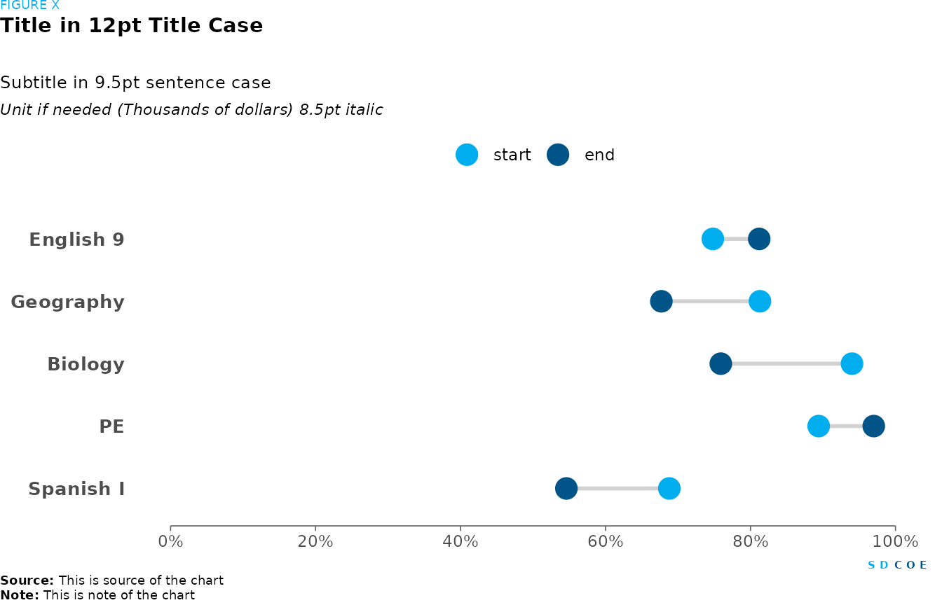
Dumbbell chart
# Data
passing_rate <- tibble(
  Fields = c("English 9", "Geography", "Biology", "PE", "Spanish I"),
  pre = c(0.748, 0.813, 0.94, 0.894, 0.688),
  post = c(0.812, 0.677, 0.759, 0.97, 0.546),
  pre.y.value = c(2.5, 2, 1.5, 1, 0.5),
  post.y.value = c(2.5, 2, 1.5, 1, 0.5)
)

# Create a new column for the difference between pre and post passing rates
passing_rate <- passing_rate |>
  mutate(Fields = factor(Fields, levels = c("Spanish I", "PE", "Biology", "Geography", "English 9")))

# Create a ggplot object for the dumbbell chart
fig <- ggplot(passing_rate, aes(x = pre, xend = post, y = Fields, yend = Fields)) +
  # Add segments connecting pre and post points
  geom_segment(size = 1, color = palette_sdcoe_main[[2]]) +
  # Add pre points
  geom_point(aes(x = pre, color = palette_sdcoe_main[[1]]), size = 5) +
  # Add post points
  geom_point(aes(x = post, color = palette_sdcoe_main[[3]]), size = 5) +
  # Customize x-axis
  scale_x_continuous(limits = c(0, 1), breaks = seq(0, 1, 0.2), labels = percent) +
  # Set color scale
  scale_color_manual(
    values = c(palette_sdcoe_main[[3]], palette_sdcoe_main[[1]]),
    labels = c("start", "end")
  ) +
  # Set plot theme to minimal
  theme_minimal() +
  # Customize plot guides
  guides(
    # Add minor ticks on x-axis
    x = guide_axis(cap = "both")
  ) +
  # Customize y-axis text
  theme(
    # Set y-axis text size and font face to bold
    axis.text.y = element_text(size = 10, face = "bold"),
    # Customize x-axis line
    axis.line.x = element_line(color = palette_sdcoe_lt_gray[[7]], linewidth = 0.3),
    # Customize axis ticks
    axis.ticks.x = element_line(color = palette_sdcoe_lt_gray[[7]], linewidth = 0.3),
    # Remove axis titles
    axis.title = element_blank(),
    # Set legend position
    legend.position = "top",
    # Remove legend title
    legend.title = element_blank(),
    # Remove grid lines
    panel.grid = element_blank()
  )

# Create SDCOE plot with annotations and formatting
sdcoe_plot(sdcoe_figure("FIGURE X"),
  # Add title
  sdcoe_title("Title in 12pt Title Case"),
  # Add subtitle
  sdcoe_subtitle("Subtitle in 9.5pt sentence case"),
  # Add y-axis title
  sdcoe_y_title("Unit if needed (Thousands of dollars) 8.5pt italic"),
  # Add the previously created plot
  fig,
  # Add SDCOE logo
  sdcoe_logo_text(),
  # Add data source
  sdcoe_source("This is source of the chart"),
  # Add note
  sdcoe_note("This is note of the chart"),
  # Set layout parameters
  ncol = 1, heights = c(1, 5, 1, 1, 30, 1, 1, 1)
)
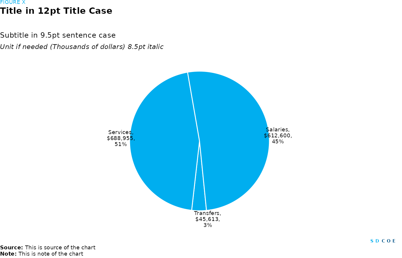
Pie charts and pie alternatives
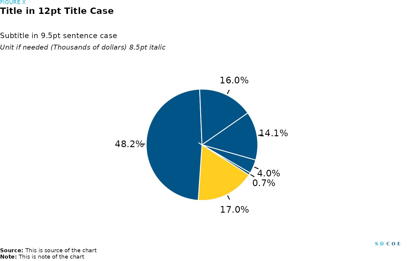
Pie Chart
# Data
pie_data <- tibble(
  Services = c(688955L),
  Transfers = c(45613L),
  Salaries = c(612600L),
  Total = c(1347168L)
)

# Data wrangling
pie_data <- pie_data |>
  # Convert data from wide to long format, excluding Total
  pivot_longer(
    cols = -Total,
    names_to = "Category",
    values_to = "Amount",
  ) |>
  # Arrange data in ascending order of Amount
  arrange(Amount) |>
  # Wrangle data for plotting
  mutate(
    # Calculate percentage of total for each category
    Percentage = Amount / Total,
    # Reorder categories for better visualization
    Category = factor(Category, levels = unique(Category)),
    # Create labels with category name, amount, and percentage
    Labels = paste0(
      Category, ", ",
      comma(Amount, prefix = "$"), ", ",
      percent(Percentage, accuracy = 1)
    ),
    # Calculate cumulative sum of percentages in reverse order
    csum = rev(cumsum(rev(Percentage))),
    # Calculate position for labels
    pos = Percentage / 2 + lead(csum, 1),
    # Replace NA positions with half of the percentage
    pos = if_else(is.na(pos), Percentage / 2, pos)
  )

# Plotting
fig <- ggplot(pie_data, aes(x = "", y = Percentage)) +
  # Create pie slices
  geom_col(width = 1, color = "white", fill = palette_sdcoe_main[[3]]) +
  # Set polar coordinates
  coord_polar("y", start = -(pi + 0.1), clip = "off") +
  # Customize y-axis with labels and breaks
  scale_y_continuous(
    breaks = pie_data$pos + 0.016, limits = c(0, 1),
    labels = str_wrap(pie_data$Labels, width = 10)
  ) +
  # Adjust x-axis scale
  scale_x_discrete(expand = c(0, 0.5)) +
  theme(
    # Remove axis title
    axis.title = element_blank(),
    # Customize axis text size
    axis.text = element_text(size = 7),
    # Remove axis lines
    axis.line = element_blank(),
    # Remove gridlines
    panel.grid = element_blank()
  )
# Create SDCOE plot with annotations and formatting
sdcoe_plot(sdcoe_figure("FIGURE X"),
  # Add title
  sdcoe_title("Title in 12pt Title Case"),
  # Add subtitle
  sdcoe_subtitle("Subtitle in 9.5pt sentence case"),
  # Add y-axis title
  sdcoe_y_title("Unit if needed (Thousands of dollars) 8.5pt italic"),
  # Add the previously created plot
  fig,
  # Add SDCOE logo
  sdcoe_logo_text(),
  # Add data source
  sdcoe_source("This is source of the chart"),
  # Add note
  sdcoe_note("This is note of the chart"),
  # Set layout parameters
  ncol = 1, heights = c(1, 5, 1, 1, 30, 1, 1, 1)
)
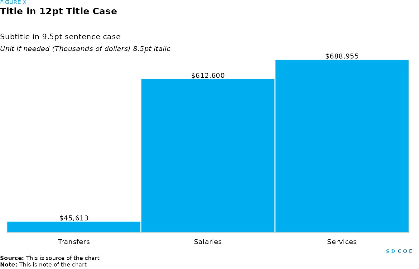
Bar Chart
# Data
bar_data <- tibble(
  Services = c(688955L),
  Transfers = c(45613L),
  Salaries = c(612600L),
  Total = c(1347168L)
)

# Data wrangling
bar_data <- bar_data |>
  # Convert data from wide to long format, excluding Total
  pivot_longer(
    cols = -Total,
    names_to = "Category",
    values_to = "Amount"
  ) |>
  # Arrange data in ascending order of Amount
  arrange(Amount) |>
  mutate(
    # Calculate percentage of total for each category
    Percentage = Amount / Total,
    # Specify order of categories for better visualization
    Category = factor(Category, levels = unique(Category)),
    # Create labels with category name, amount, and percentage
    Labels = comma(Amount, prefix = "$")
  )

# Plot
fig <- bar_data |>
  # Set aesthetics
  ggplot(aes(x = Category, y = Percentage)) +
  # Add column plot
  geom_col(
    position = position_stack(),
    fill = palette_sdcoe_main[[3]],
    width = 1,
    color = "white"
  ) +
  # Add text labels to the bars
  geom_text(aes(label = Labels),
    # Position labels above the bars
    nudge_y = 0.01,
    # Set text size
    size = 3,
    # Hide legend for the text labels
    show.legend = FALSE
  ) +
  # Allow text to extend beyond plot area
  coord_cartesian(clip = "off") +
  # Remove expansion space around y-axis
  scale_y_continuous(expand = c(0, 0)) +
  # Remove expansion space around x-axis
  scale_x_discrete(expand = c(0, 0)) +
  # Remove ticks from x and y axes
  remove_ticks() +
  # Remove both x and y axes
  remove_axis() +
  # Remove axis labels
  labs(x = NULL, y = NULL) +
  theme(
    # Set axis line width
    axis.line.x = element_line(linewidth = 0.1)
  )


# Create SDCOE plot with annotations and formatting
sdcoe_plot(sdcoe_figure("FIGURE X"),
  # Add title
  sdcoe_title("Title in 12pt Title Case"),
  # Add subtitle
  sdcoe_subtitle("Subtitle in 9.5pt sentence case"),
  # Add y-axis title
  sdcoe_y_title("Unit if needed (Thousands of dollars) 8.5pt italic"),
  # Add the previously created plot
  fig,
  # Add SDCOE logo
  sdcoe_logo_text(),
  # Add data source
  sdcoe_source("This is source of the chart"),
  # Add note
  sdcoe_note("This is note of the chart"),
  # Set layout parameters
  ncol = 1, heights = c(1, 5, 1, 1, 30, 1, 1, 1)
)
Pie charts and pie chart alternatives (many categories)
Pie Chart
# Data
spending <- tibble(
  Category = c("Special Funds", "Federal", "Fees", "Other", "LCFF", "Categorical"),
  Amount = c(3650251, 22026735, 77519245, 87915690, 93504435, 265285834)
)

# Data wrangling
spending <- spending |>
  # Arrange data in descending order of Amount
  arrange(desc(Amount)) |>
  mutate(
    # Calculate percentage of total spending
    Percentage = Amount / sum(Amount),
    # Highlight LCFF category
    Highlights = ifelse(Category == "LCFF", "1", "0"),
    # Specify order of categories for better visualization
    Category = factor(Category, levels = unique(Category)),
    # Create labels with category name, amount, and percentage
    Labels = paste0(
      Category,
      ", ",
      comma(Amount, prefix = "$"),
      ", ",
      percent(Percentage, accuracy = 1)
    )
  ) |>
  # create position for text
  arrange(desc(Highlights)) |>
  mutate(text_y = cumsum(Amount) - Amount / 2)

# Plotting
fig <-
  ggplot(spending, aes(x = "", y = Amount, fill = Highlights)) +
  # Create pie slices
  geom_col(show.legend = FALSE,
           width = 1,
           color = "white") +
  # add lebels
  geom_text(
    aes(label = scales::percent(Percentage), y = text_y),
    nudge_x = 0.8,
    size = 4,
    show.legend = F
  ) +
  # add arrows
  geom_segment(aes(
    x = 1.52,
    y = text_y,
    xend = 1.6,
    yend = text_y
  ),
  size = .5) +
  # Set polar coordinates
  coord_polar(theta = "y",
              start = -(pi + 1),
              clip = "off") +
  # Adjust x-axis scale
  scale_x_discrete(expand = c(0, 0.5)) +
  theme(
    # Remove axis title
    axis.title = element_blank(),
    # Remove axis text
    axis.text = element_blank(),
    # Remove axis lines
    axis.line = element_blank(),
    # Remove gridlines
    panel.grid = element_blank()
  )

# Create SDCOE plot with annotations and formatting
sdcoe_plot(
  sdcoe_figure("FIGURE X"),
  # Add title
  sdcoe_title("Title in 12pt Title Case"),
  # Add subtitle
  sdcoe_subtitle("Subtitle in 9.5pt sentence case"),
  # Add y-axis title
  sdcoe_y_title("Unit if needed (Thousands of dollars) 8.5pt italic"),
  # Add the previously created plot
  fig,
  # Add SDCOE logo
  sdcoe_logo_text(),
  # Add data source
  sdcoe_source("This is source of the chart"),
  # Add note
  sdcoe_note("This is note of the chart"),
  # Set layout parameters
  ncol = 1,
  heights = c(1, 5, 1, 1, 30, 1, 1, 1)
)
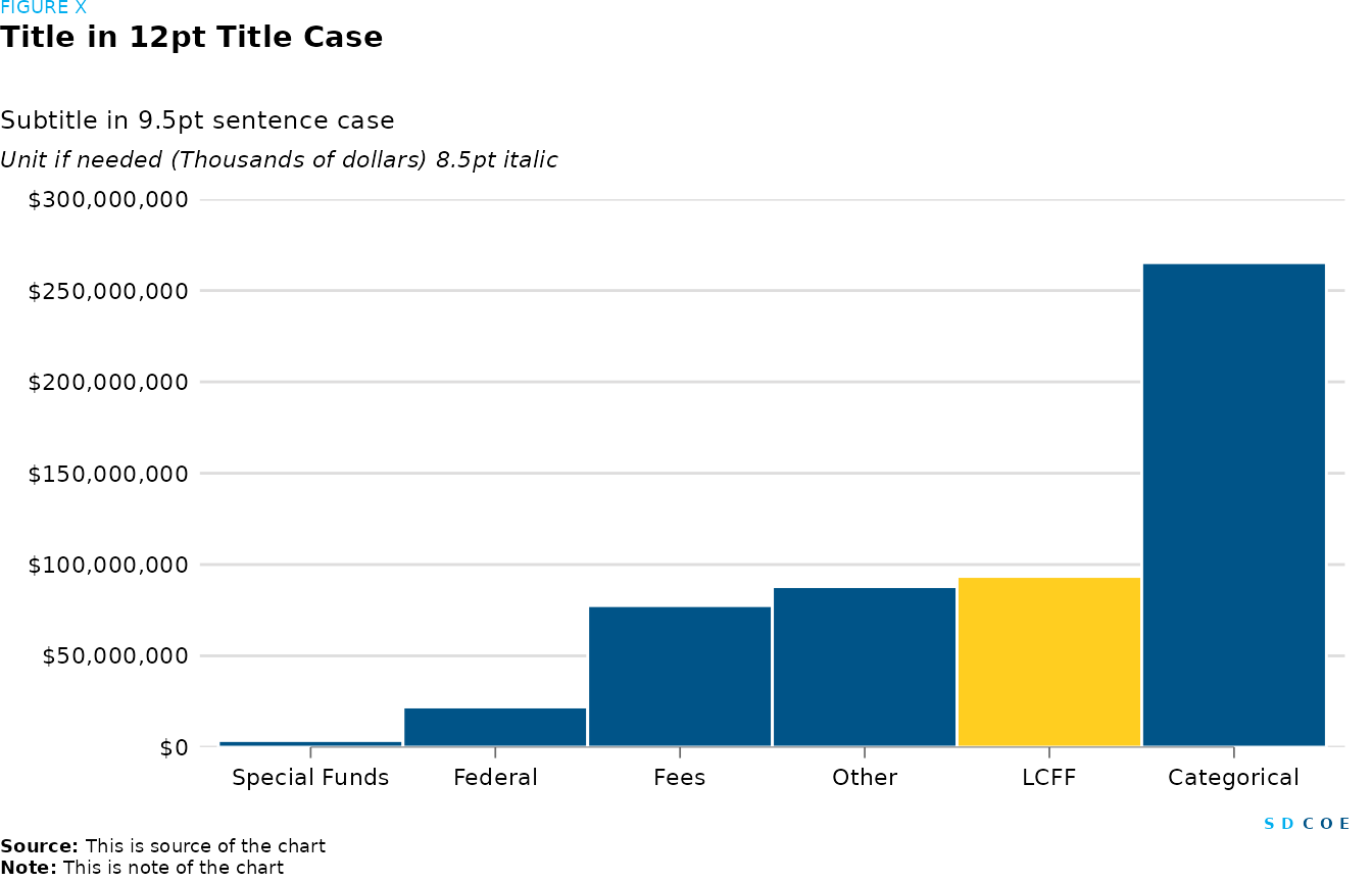
Bar Chart
# Data
spending <- tibble(
  Category = c("Special Funds", "Federal", "Fees", "Other", "LCFF", "Categorical"),
  Amount = c(3650251, 22026735, 77519245, 87915690, 93504435, 265285834)
)

# Data wrangling

spending <- spending |>
  # Arrange data in ascending order of Amount
  arrange(Amount) |>
  mutate(
    # Highlight LCFF and Categorical categories
    Highlights = ifelse(Category == "LCFF", "1", "0"),
    # Specify order of categories for better visualization
    Category = factor(Category, levels = unique(Category))
  )

# Plot
fig <- spending |>
  # Set aesthetics for ggplot
  ggplot(aes(x = Category, y = Amount, fill = Highlights)) +
  # Add column plot
  geom_col(position = "dodge", width = 1, color = "white") +
  # Customize fill colors
  scale_fill_manual(values = c("0" = palette_sdcoe_main[[1]], "1" = palette_sdcoe_main[[4]])) +
  # Customize y-axis
  scale_y_continuous(expand = c(0, 0), limits = c(0, 300e+06), labels = dollar, n.breaks = 6) +
  # Add minor ticks on x-axis
  guides(
    x = guide_axis(cap = "both", minor.ticks = TRUE)
  ) +
  # Remove axis labels
  labs(x = NULL, y = NULL) +
  # Customize plot theme
  theme(
    # Set axis ticks color and width
    axis.ticks = element_line(color = palette_sdcoe_lt_gray[[7]], linewidth = 0.3),
    # Remove legend
    legend.position = "none",
    # Remove y-axis line
    axis.line.y = element_blank(),
    # Customize x-axis line
    axis.line.x = element_line(linewidth = 0.1),
    # Set plot margins
    plot.margin = margin(t = 10, r = 10, l = 10, b = 10)
  )

# Create SDCOE plot with annotations and formatting
sdcoe_plot(sdcoe_figure("FIGURE X"),
  # Add title
  sdcoe_title("Title in 12pt Title Case"),
  # Add subtitle
  sdcoe_subtitle("Subtitle in 9.5pt sentence case"),
  # Add y-axis title
  sdcoe_y_title("Unit if needed (Thousands of dollars) 8.5pt italic"),
  # Add the previously created plot
  fig,
  # Add SDCOE logo
  sdcoe_logo_text(),
  # Add data source
  sdcoe_source("This is source of the chart"),
  # Add note
  sdcoe_note("This is note of the chart"),
  # Set layout parameters
  ncol = 1, heights = c(1, 5, 1, 1, 30, 1, 1, 1)
)